A Better Diabetes UX
Client
mySugr
Year
2022
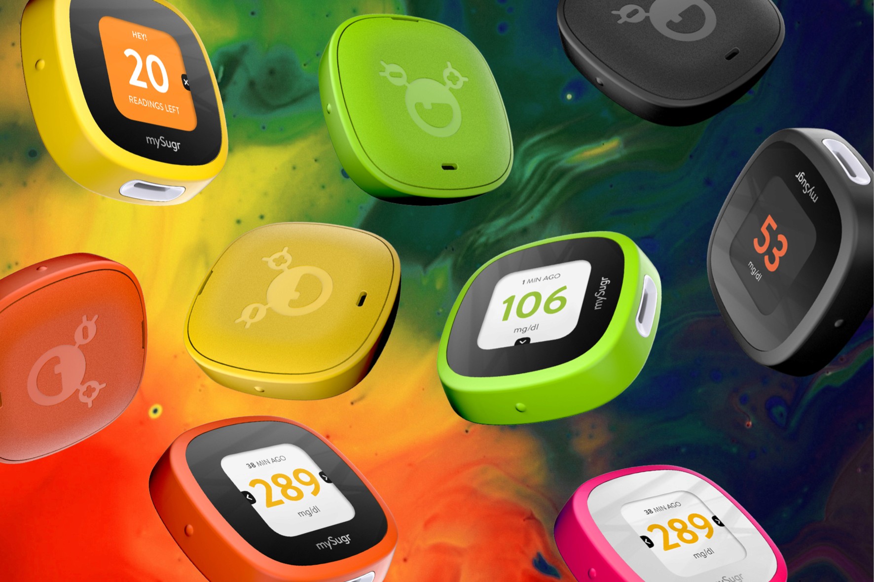
In line with mySugr's mission of 'making diabetes suck less', I was tasked to design one of the least exciting gadgets in the world, a blood-glucose meter, and make it feel as friendly as their cheeky mySugr app. This mission took me down a rabbit hole and I ended redesigning the complete user experience.
HOW I ROLLED
Interview, listen, observe: I sat down with the mySugr crew and folks living with diabetes to map the daily challenges, pain points, frictions, ideas, concerns, etc. I quickly identified all opportunities to create value and summarized them in different personas and their user journey. I shared the ideas and proposals for a smooth user experience using storyboards and mood boards to build alignment and gather more feedback.
Spied on the usual suspects: I tore apart every “hospital-white” meter on the shelf to learn what not to do.
WHAT CAME OUT?
A clean, user-friendly meter that would sync with the app like if they grew up together
A matching lancing device that didn’t look like a medieval spike
Curved test strips so numb fingertips could actually pick them up
A strip dispenser. Think PEZ, but without the sugar rush.
Carry bags in punchy colors and limited-edition drops, turning “medical kit” into “lifestyle gear that I love!”